 CodeCharge Studio
Component attributes are dynamic HTML attributes and variables that can be modified at runtime, either automatically or programmatically. They are introduced in CCS version 3.1 to make working with page layout more flexible and simplify creating dynamic HTML output, especially where the Label control may not be functional. Component attributes can be added outside or inside standard HTML tags for such purposes as dynamically applying table row style, deactivating a field, displaying ALT text for an image, etc. They also can and should be used in place of template variables, which was previously an internal feature of the generated code and therefore not sufficiently flexible for custom use.
To insert a component attribute into HTML, switch to the HTML mode and right-click click on the place where you want to insert it, then choose Insert attribute option. You will be presented with the attribute configuration dialog as shown below.
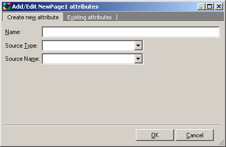
The dialog allows you to create a new attribute, or select one of previously setup (existing) attributes. You create a new attribute or modify an existing one by configuring the following fields:
| Parameter | Description |
|---|---|
| Name | A unique name you want to assign to your attribute. |
| Source Type | Type of the source that will provide data for the attribute, such as: Expression, URL, Form, Session, Application, Cookie, or DataSource Column.
Leave this field blank if you will control the attribute value programmatically. |
| Source Name | The name of the source containing the value to be assigned to the attribute.
For example source name "abc" used with the source type "URL" will dynamically retrieve attribute's value from such URL
as: |
When created, the new attribute will be inserted into the HTML in the following format:
{Component_Name:Attribute_Name}
Where the Component_Name prefix is either the name of the parent component, such as record or image, or the word "page" if placed at the page level outside of any components. When subsequently modifying the HTML manually, it is important to note that an attribute that corresponds to specific component must be placed within the HTML template of that component, for example:
<input type="text" name="{TextBox1_Name}" value="{TextBox1}" style="{TextBox1:style}">
<!-- BEGIN TextBox TextBox1 -->{TextBox1:someAttr}<input type="text" name="{TextBox1_Name}" value="{TextBox1}">!-- END TextBox TextBox1 -->
<!-- BEGIN Record NewRecord1 -->
...
<input type="text" name="{TextBox1_Name}" value="{TextBox1}" style="{NewRecord1:style}">
...
<-- END Record NewRecord1 -->
Examples of attributes placed incorrectly, outside component's template:
{TextBox1:someAttr}<input type="text" name="{TextBox1_Name}" value="{TextBox1}">
{TextBox1:someAttr}<!-- BEGIN TextBox TextBox1 --><input type="text" name="{TextBox1_Name}" value="{TextBox1}">!-- END TextBox TextBox1 -->
Attributes placed at page level have predefined prefix named "page" which can be used anywhere on the page without limitations. However, these attributes are always related to the master page, thus if you use page attribute within an includable page its value will be retrieved from the master's page collection.
The following example demonstrates how to improve Web accessibility by applying ALT text to images, for example in Web-based gallery.
Use the Gallery Builder to create a gallery based on the Employees table in the supplied Intranet database, then switch to the HTML mode and find HTML code that represents image link, similar to the one below:
<a href="{picture}"><img src="{picture_Src}" border="0"></a>
Now edit the HTML to create an ALT attribute, and then add an attribute named AltAttr as shown below:
<a href="{picture}"><img src="{picture_Src}" border="0" alt="{picture:AltAttr}"></a>
Use the following attribute configuration:
| Name | AltAttr |
|---|---|
| Source Type | DataSource column |
| Source Name | emp_name |