 CodeCharge Studio
Often a grid form is used in conjunction with a record form to display multiple records and a link from the grid form records to the record form where the details of the record can be viewed and edited. For this purpose, the Grid and Record builder can be used to produce a grid form with an attendant record form. To begin, click on the Grid and Record Builder option in the Builder tab.
Select or create the database connection whose fields will be used in the two forms. You can select one of the existing database connections, create a new connection or select one of the sample databases.
| Parameter | Description |
|---|---|
| Autoincremented primary keys | If the database table has an autoincremented primary key field this prevents the builder from creating a record form with the primary key field since it will be provided by the database when a new record is inserted. |
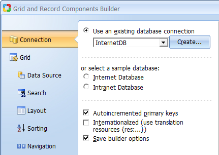
Click Next to proceed to step 2.
Select the fields to be shown in the grid form.
| Parameter | Description |
|---|---|
| Data Source | Select the table from where the data will be retrieved. |
| Build Query | Brings up the Visual Query Builder window where you can setup a SQL query that will act as the grid data source. |
| Fields for the Grid | These are the fields to be shown in the grid. They are selected from among the Available Fields. |
 |
Refreshes the connection if you make changes to the database while using the builder. |
 |
Select a form field then click this button to move it upwards in the order of appearance. |
 |
Select a form field then click this button to move it downwards in the order of appearance. |
 |
Click this button to add it some fields to the form. |
 |
Select a form field then click this button to remove it from the form. |
 |
Opens the dialog with advanced properties. To activate the button select a field in the Fields for the Grid section.
Note: The following field types have advanced properties: CheckBox List, ListBox, Radio Button, Link and Image Link. CheckBox List, ListBox or Radio Button - Clicking on the button will open the 'List DataSourse' dialog illustrated below. Link and Image Link - Clicking on the button will open the dialog with link properties. |
| Order by | Order the records in the grid will be initially displayed. |
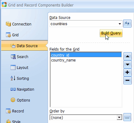
Click Next to proceed to step 3.
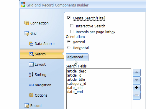
Step 3 is optional and should be used only if you want to have a search form that can filter the records displayed in the grid. If a search form is not needed click Next to proceed to step 4.
| Parameter | Description |
|---|---|
| Create Search/Filter | Indicates your intention to create a search form. |
| Interactive Search | Add autocomplete feature to every field. |
| Records per page list box | The search form will have a list-box that can be used to specify the number of records to be returned per page. |
| Orientation | Specifies vertical or horizontal orientation of the search form. |
| Advanced... | Click this button to specify the advanced search option such as a submit method, type and other provided options. If the "AND" condition is selected, the search form will contain an input control (textbox or listbox) for all selected database fields. If the "OR" condition is selected, the search form will include only one textbox control and a value entered into the textbox will be used to search against all selected database fields. Alternatively, you can choose the "Advanced Search" option which creates a single textbox, while also automatically adding a listbox with search options, so that users can specify whether they want to search for "Any Words", "All Words", or "Exact Phrase". |
| Search Fields | These are the fields to be shown in the search form. |
|
Refreshes the connection if you make changes to the database while using the builder. |
|
Select a form field then click this button to move it upwards in the order of appearance. |
|
Select a form field then click this button to move it downwards in the order of appearance. |
|
Click this button to add it some fields to the form. |
|
Select a form field then click this button to remove it from the form. |
|
Opens the dialog with advanced properties. To activate the button select a field in the Fields for the Grid section.
Note: The following field types have advanced properties: CheckBox List, ListBox, Radio Button, Link and Image Link. CheckBox List, ListBox or Radio Button - Clicking on the button will open the 'List DataSourse' dialog illustrated below. Link and Image Link - Clicking on the button will open the dialog with link properties. |
| Control Type | Specify the control type to be used for each of the fields in the form. |
Click Next to proceed to step 4.
Specify the type of layout in the grid form.
| Parameter | Description |
|---|---|
| Layout | Select layout for the grid form. |
| Add template panel | Insert component inside Template Panel. This option available only on pages with Designs. Read more... |
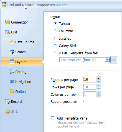
Click Next to proceed to step 5.
Specify the type of sorting controls to appear in the grid form.
| Parameter | Description |
|---|---|
| Sorting | Select the type of sorting controls that you want to have in the grid. |
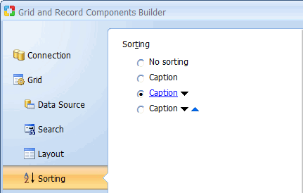
Click Next to proceed to step 6.
Specify the type of navigation controls to appear in the grid form.
| Parameter | Description | Page Navigator | Select the type of navigation controls that you want to have in the grid. |
|---|---|
| Modify | Opens the 'Custom Navigator' window where you can customize the controls to suit your needs. |
| Records per page | Specify the default number of records to be shown per page. |
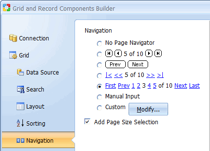
Click Next to proceed to step 7.
Further customize the grid form by selecting the caption to be used for sorting as well as the navigational controls.
| Parameter | Description |
|---|---|
| Page Navigator | Select the type of Navigation controls that you want to have in the grid. |
| Modify | The 'Custom Navigator' window allows you to add custom navigation controls to the form. |
| Records per page | Specify the default number of records to be shown per page. |
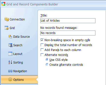
| No records found message | Specify the message that will be displayed in the grid form if there are no records to be shown. |
| Non-breaking space | Inserts a non-breaking space ( ) into empty grid cells. This option is used to make browsers display cell borders even if a cell is completely empty. |
| Display the total number of records | Specify if the label which shows the total number of records in the record set should be displayed above the grid. |
| Add Panels to each column (for Hide/Show functionality) | Specify if all controls are taken into the blocks of the following type: <!-- BEGIN ControlType ControlName --><!-- END ControlType ControlName --> It will be used to dynamically hide/show controls on the page. |
Alternate records
If this option is checked, every other record in the grid will appear in a row
with a different style than the preceding record. You can further choose how the
alternate rows should be implemented. Selecting "Create alternate controls"
will create two data rows, where one row will have a different background color
to emphasize the separation between consecutive rows. Selecting "Use CSS
style" applies the Set Row Style action to the Before Show Row
event of the grid, where in turn the main and alternate CSS style classes are
specified. By default the Set Row Style action will apply the Row style
class to standard grid rows and the AltRow class to alternate grid rows.
Both these classes are defined within the "Style.css" file used by the
current page or grid and can be modified as needed.
Click Next to proceed to step 8.
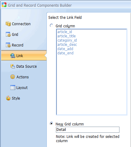
The last step in configuring the grid is selecting the field to be used to link the records in the grid to the details in the record form. You can select any one of the fields that are already in the grid or specify a new column to act as the link to the record form.
Click Next to proceed to step 9.
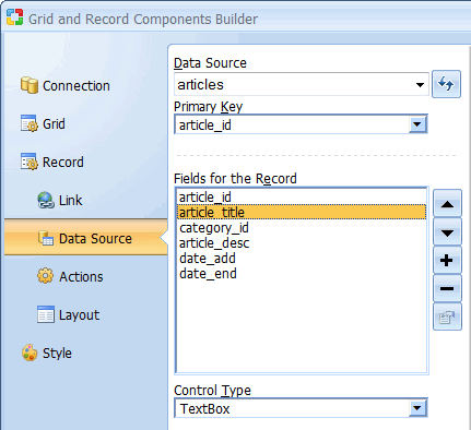
The record form will be based on the same table as was the grid form but you have the option of selecting different fields to appear in the record form. After adding the fields, you should also select the Control Type to be used for each of the fields.
At this point, you can use the Preview button to view the final form.
Click Next to proceed to step 10.
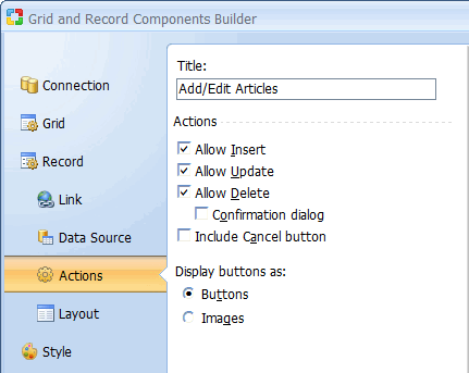
Select the type of operations you want the user to be able to perform using the record form. In the illustration below, the 'Allow Delete' option is disabled meaning that the record form will not allow the user to delete any existing records.
Click Next to proceed to step 11.
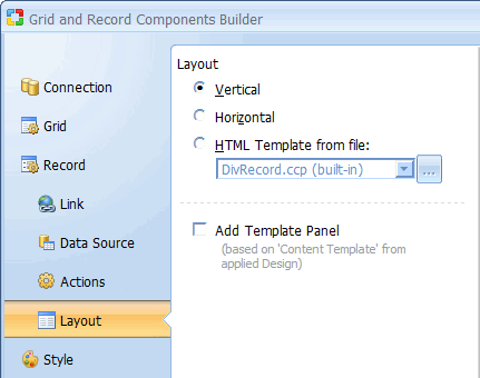
Specify the type of layout in the record form.
| Parameter | Description |
|---|---|
| Layout | Select layout for the record form. |
| Add template panel | Insert component inside Template Panel. This option available only on pages with Designs. Read more... |
Click Next to proceed to step 12.
Select a style to be used to display both forms. Click the Finish button to close the builder and generate the forms.