 CodeCharge Studio
The simplest and most convenient way of building an Editable Grid is to use the Editable Grid builder located under the Builders tab. Open or create a new page where the Editable Grid will be located then with the cursor placed at the location where the form should appear, click on the Editable Grid option under the Builders tab of the Toolbox.
Select or create a database connection from where the data to be edited or added using the record form is stored. If you already have a connection configured for the project, you can select to use one of the tables in this connection to create the Editable Grid. Alternatively, you can create a new connection or use one of the sample databases.
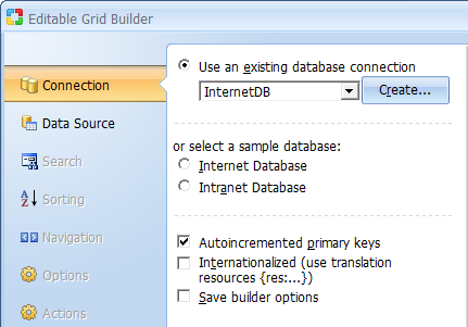
The Autoincremented primary keys checkbox should be activated if the records that will be contained in the Editable Grid will have autoincrement primary keys that are provided automatically by the database. With this option selected, the Editable Grid will not have an editable or submittable control for the primary key since that would result in a database error. Conversely, if primary keys are user provided, then this option should not be selected. In this case, the Editable Grid would have a field where the user can enter a value for the primary key.
Click Next to proceed to step 2.
You now have to select a data source as well as the fields to be included in the editable grid form.
| Parameter | Description |
|---|---|
| Data Source | Select the table or query that contains the fields to be used in the EditableGrid. |
| Build Query | Opens the Visual Query Builder where you can construct a join query which retrieves fields from multiple tables. Within the Visual Query Builder window, you can select multiple related tables then select fields from those tables. |
| Primary Key |
Normally, the Primary Key will be automatically set if the database table is defined with a Primary Key field. There may be cases with certain databases, or database connectors, where you may need to define the key. If the table contains a compound primary key that is made up or more than one field you must use the Build Query button described above to specify all the primary keys. Within the Visual Query Builder dialog, right-click on each of the fields that make up the primary key field and select the Primary Key option. The selected fields should then appear in bold. |
| Fields for the Grid | These are the fields to be shown in the Editable Grid form. |
 |
Refreshes the connection if you make changes to the database while using the builder. |
 |
Select a form field then click this button to move it upwards in the order of appearance. |
 |
Select a form field then click this button to move it downwards in the order of appearance. |
 |
Click this button to add it some fields to the form. |
 |
Select a form field then click this button to remove it from the form. |
 |
Opens the dialog with advanced properties. To activate the button select a field in the Fields for the Grid section.
Note: The following field types have advanced properties: CheckBox List, ListBox, Radio Button, Link and Image Link. CheckBox List, ListBox or Radio Button - Clicking on the button will open the 'List DataSourse' dialog illustrated below. Link and Image Link - Clicking on the button will open the dialog with link properties. |
| Control Type | Specify the control type to be used for each of the fields in the form. |
| Order by | Select a field for the records to be ordered by when initially displayed. |
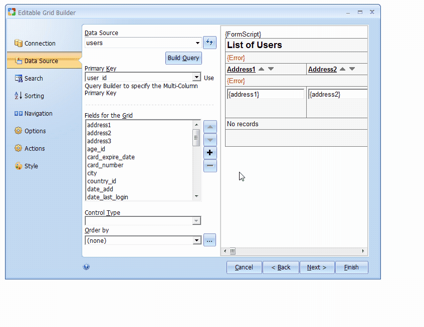
After adding fields to the editable grid and setting the optional Order by field, you can click on the Finish button to close the builder and generate the form.
Click Next to proceed to step 3.
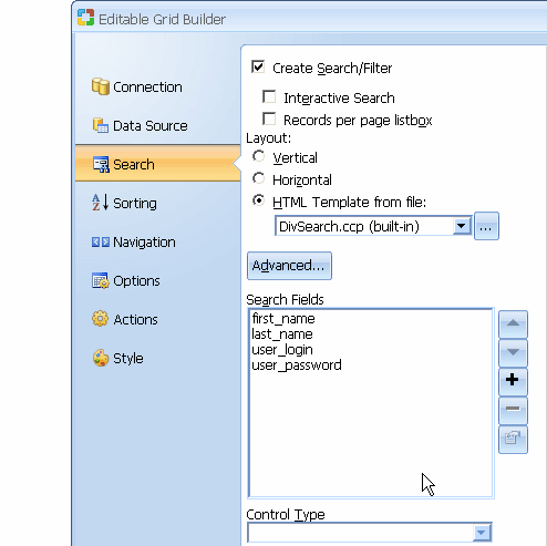
Add a search form that can be used to filter the records displayed in the editable grid form. This step is optional. If you don't want a corresponding search form for the editable grid, you can simply click the Next button to proceed to the next step.
| Parameter | Description |
|---|---|
| Create Search/Filter | Activate this option to indicate your intention to create a search form. |
| Interactive Search | Add autocomplete feature to every field. |
| Orientation | Specifies vertical or horizontal orientation of the search form. |
| Records per page list box | The search form will have a list-box that can be used to specify the number of records to be returned per page. |
| Orientation | Specifies vertical or horizontal orientation of the search form. |
| Advanced... | Additional features for the search form. You can specify whether the form should be submitted using the POST or GET method. You can also specify whether you want each database field to be represented by a search form field or alternatively have one search form field which can be used to search all database fields using the OR operator. You can also decide to use the Advanced Search option which provides an opportunity for users to select a type of search they want to perform. The “Advanced Search” option creates a single textbox, while also automatically adding a listbox with search options, so that users can specify whether they want to search for “Any Words”, “All Words”, or “Exact Phrase”. You can also opt to use the “Clear” option to allow user to clear the search fields when clicked. Additionally, you can specify that the search button be the default button so that hitting the enter key would be the same as clicking the search button. |
| Available Fields | This list-box shows all the fields available in the table or view. |
| Search Fields | These are the fields to be shown in the search form. They are selected from among the Available Fields. |
|
Refreshes the connection if you make changes to the database while using the builder. |
|
Select a form field then click this button to move it upwards in the order of appearance. |
|
Select a form field then click this button to move it downwards in the order of appearance. |
|
Click this button to add it some fields to the form. |
|
Select a form field then click this button to remove it from the form. |
|
Opens the dialog with advanced properties. To activate the button select a field in the Fields for the Grid section.
Note: The following field types have advanced properties: CheckBox List, ListBox, Radio Button, Link and Image Link. CheckBox List, ListBox or Radio Button - Clicking on the button will open the 'List DataSourse' dialog illustrated below. Link and Image Link - Clicking on the button will open the dialog with link properties. |
| Control Type | Specify the control type to be used for each of the fields in the form. |
You can try out various options and preview them before deciding on the appropriate one.
Click Next to proceed to step 4 .
| Parameter | Description |
|---|---|
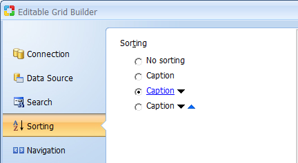
| Sorting | Select the type of sorting controls that you want to have in the grid. |
Click Next to proceed to step 5 .
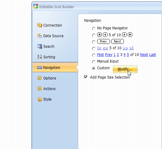
At this juncture, you can further customize the editable grid form by selecting the caption to be used for sorting as well as the navigational controls.
| Parameter | Description |
|---|---|
| Page Navigator | Select the type of Navigation controls that you want to have in the grid. |
| Modify | If you want to have custom navigation controls on the form, click Modify to open the Custom Navigator window. You can customize the controls to suit your needs.
|
Click Next to proceed to step 6.
| Parameter | Description |
|---|---|
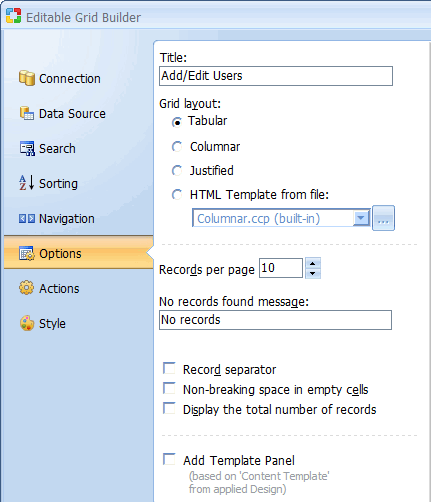
| Records per page | Specify the default number of records to be shown per page |
| No records found message | Specify the message that will be displayed in the grid form if there are no records to be shown. |
| Display the total number of records | Display the total number of records that are retrieved in a form. |
| Grid layout |
|
| Add template panel | Insert Editable Grid inside Template Panel. This option available only on pages with Designs. Read more... |
Click Next to proceed to step 7.
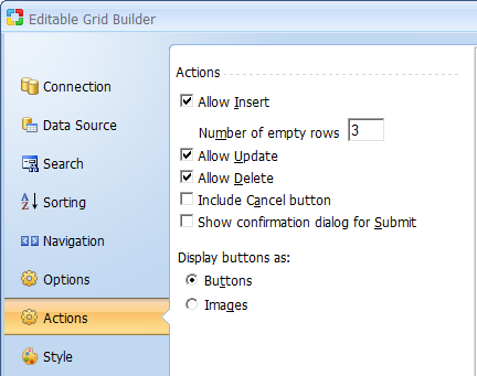
You now have to decide the kind of functionality that will be available in the editable grid form. You can uncheck any of the options if you don't want the form to have the corresponding functionality.
| Parameter | Description |
|---|---|
| Allow Insert | Specify whether the Editable Grid should allow the user to insert new records. Use the Number of empty rows property to specify the number of empty rows that should be provided for the purpose of inserting new records. |
| Allow Update | Specify whether the Editable Grid should allow the user to update existing records. |
| Allow Delete | Specify whether the Editable Grid should allow the user to delete existing records. |
| Allow Cancel | Specify whether the Editable Grid should have a cancel button which would abort any current operation and return to the page specified in the Return Page property of the form. |
| Show Confirmation dialog for Submit | Prompts the user to confirm the insert, update or delete operations. |
Click Next to proceed to step 8.
Select a style for the editable grid form. This step is optional.
| Parameter | Description |
|---|---|
| Style | This element contains a list of styles to choose from. |
After selecting a style, click the Finish button to generate the form to the page.