 CodeCharge Studio
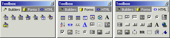
The Toolbox consists of three tabbed windows featuring a series of commands for adding various components to a page. From Figure 10-11, the toolboxes are described as follows:
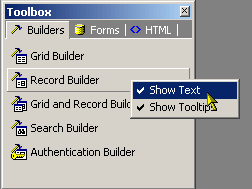
Depending on how familiar you are with the various options on the Toolbox you can opt whether or not to have it display text along with the Icons. You can also enable tooltips to be displayed when the mouse pointer hovers over a particular option. Right clicking within the Toolbox brings up a popup menu where you can toggle these features.
A builder is essentially a series of dialogs spanning the process of creating a page or form. The user configures the various options available in the series of dialogs, at the end of which the builder generates forms based on the selections made.
| Icon | Command | Description |
|---|---|---|
 |
Application Builder | Used to create multiple project pages based on the tables or queries in a designated database connection. |
 |
Grid Builder | Used to create grid forms that can optionally have a related search form. |
 |
Record Builder | Used to automate the process of creating record forms where database content can be inserted, edited or deleted. |
 |
Grid and Record Builder | Used to display multiple records and a link is provided from the grid form records to the record. |
 |
Editable Grid Builder | Used to create grid forms with multiple line inputs. |
 |
Search Builder | Used to enter values into controls such that when the values are submitted. |
 |
Directory Builder | Used to create a directory on the page based on the database table. |
 |
Date Picker Builder | Used to place the date picker/selector on the page. |
 |
Authentication Builder | Used to input authentication details (Login and Password) that are required to grant access to users in sites that implement security. |
A form refers to a section of a page containing normal content, markup, labels and optionally may contain an HTML form element with form controls in it. A CodeCharge Studio form is visually demarcated using one or more HTML tables with various content appearing in the table rows and columns.
Controls are dynamic elements placed on a page and are often used to display database content. Controls play a central role in any given form that deals with database content. Controls and their values can also be controlled programmatically.
| Icon | Command | Description |
|---|---|---|
 |
Button | Serves the purpose of submitting all the fields within the form to the designated action page. |
 |
Check Box | Used to toggle the selection of an option. |
 |
Check Box List | Used to toggle the list of option selections. |
 |
Date Picker | Used to toggle the date selector. |
 |
Directory | Used to present the directory. |
 |
Editable Grid | Used to present the multiple line inputs placed inside the table. |
 |
Grid Form | Used to display multiple records of data. |
 |
Hidden | Equivalent of a Text Box except that a hidden field has no visual representation on the rendered page. |
 |
Image | Used to embed an image into the current page. |
 |
Image Link | Used to represent the link, an image is used. |
 |
Include Page | Used to include pages, e.g. header and footer pages. |
 |
Label | Used to represent a wide variety of content. |
 |
Link | Used extensively in grid forms whereby you can have a simple link that links to another page. |
 |
List Box | Used to present a list of options from which the user can select one. |
 |
Navigator | Used exclusively on grid forms. A navigator provides functionality that allows the database records within a grid to be browsed. |
|
Path | Used to represent a path. |
 |
Radio Button | Used for the selection of mutually exclusive options. |
 |
Record Form | Used to add, edit or delete database content. |
 |
Sorter | Used exclusively on grid forms. It allows the data within the grid to be sorted according to a particular field. |
 |
Text Area | Used to when a large amount of data needs to be entered. |
 |
Text Box | Used to provide single line input. |
You can add HTML elements to the page as needed. After adding an HTML element, you can further customize it.
| Icon | Command | Description |
|---|---|---|
 |
Form | A form is a container object within which you can place other form controls that submit values. |
 |
Text Box | Used to provide single line input. |
 |
Password | Same as Text Box except that all characters entered are masked using asterisks. |
 |
Text Area | Used when a large amount of data needs to be entered. |
 |
Radio Button | Used for the selection of mutually exclusive options. |
 |
Dropdown | Used to present a list of options from which the user can select one. |
 |
Listbox | Same as a dropdown with the distinction of being able to display multiple options. |
 |
Button | Performs a specified action when clicked. |
 |
Submit Button | Serves the purpose of submitting all the fields within the form to the designated action page. |
 |
Reset Button | Used to return the fields in a form to the state they originally were in when the page loaded. |
 |
Image Button | Graphical equivalent of the Submit Button. |
|
Label | used to provide text that identifies other elements within the page. |
 |
Hyperlink | Link to another resource. |
 |
Image | Used to embed an image in the current page. |
 |
ImageLink | Same as a HyperLink, an image is used to represent the link. |
 |
Space | Non-breaking space meaning that a line break cannot occur in its place. |
 |
Line Break | Ends the current line of text and continues the flow of content on the next line. |
 |
Horizontal Rule | Used to demarcate sections of a page. |
 |
Paragraph Break | Represents a paragraph. |
 |
Bookmark | Named anchor that can be the destination of another link. |
 |
Comment | Represents a comment. |