 CodeCharge Studio
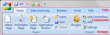
The main menu you can open after click at the CodeCharge Studio logo. Notice that the main menu names and some of the sub-menus have an underlined letter. This is indication that that menu can be executed using a short-cut key combination by pressing the Ctrl key together with the underlined letter.
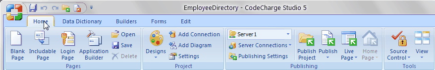
The title bar contains the name of the application (i.e., CodeCharge Studio) and the open project. The right end of the title bar contains buttons to minimize, maximize, or close the application window and buttons: Fullscreen, Options, Help.
There are three basic components to the Ribbon:
Commands are arranged in groups. A command can be a button, a menu, or a box where you enter information.
Groups are sets of related commands, displayed on tabs. They pull together all the commands you're likely to need for a type of task, and they remain on display and readily available, giving you rich visual aids.
Tabs sit across the top of the Ribbon. Each one represents core tasks you do in a given program. Availible tabs: Home, Data Dictionary, Builders, Forms, Edit, Table.
| Command | Description |
|---|---|
 |
Create a new Page |
 |
Includable Page |
 |
Login Page |
 |
Application Builder |
 |
Designs |
 |
Publish the project |
 |
Publish the current page |
 |
Home Page |
 |
Source Countrol |
 |
View |
 |
Select the server for the project |
 |
Open an existing Page |
 |
Save the current page |
 |
Save all changes made in multiple documents |
 |
Delete |
 |
Undo the last action |
 |
Redo the last action that was undone |
 |
Cut the current selection and place it in the clipboard |
 |
Copy the current selection to the clipboard |
 |
Paste the current contents of the clipboard |
 |
Open the Project Settings window |
 |
Add Connection |
 |
Add Diagram |
 |
Settings |
 |
Publishing Settings |
 |
Server Connections |
 |
Quick Live Page |
 |
Live Page in Browser |
 |
Quick Live Page in Browser |
 |
Home Page in Browser |
The Toolbox consists of three tabbed windows featuring a series of commands for adding various components to a page. From Figure 10-11, the toolboxes are described as follows:
Depending on how familiar you are with the various options on the Toolbox you can opt whether or not to have it display text along with the Icons. You can also enable tooltips to be displayed when the mouse pointer hovers over a particular option. Right-click within the Toolbox to bring up a popup menu where you can toggle these features.
| Icon | Command |
|---|---|
 |
Open Connectios |
 |
Relations |
 |
Add Query |
 |
Query Type |
 |
Add Table to FROM |
 |
Add Condition to WHERE |
 |
Rebuld SQL |
 |
Add Parameter To SQL |
 |
Edit connection |
 |
Refresh |
 |
Export |
 |
Import |
 |
Table |
 |
SQL |
 |
Stored Procedure |
 |
Insert Brackets |
 |
Remove Brackets |
 |
Edit Condition |
 |
Group By |
 |
Order By |
|
Delete |
 |
Add Parameter |
 |
Parameter Property |
|
Delete Parameter |
A builder is essentially a series of dialogs spanning the process of creating a page or form. The user configures the various options available in the series of dialogs. At the end of which the builder generates forms based on the selections made.
| Icon | Command | Description |
|---|---|---|
 |
Grid Builder | Used to create grid forms that can optionally have a related search form. |
 |
Record Builder | Used to automate the process of creating record forms where database content can be inserted, edited or deleted. |
 |
Report Builder | Used to create report forms. |
 |
Calendar Builder | Used to create calendar forms. |
 |
Menu Builder | Used to create menus. |
 |
Autocomplete Builder | Used for simplify the process of adding an Autocomplete feature to forms. |
 |
Dependant ListBoxes Builder | Used for simplify the process of adding an Dependant ListBoxes feature to forms. |
 |
Autofill Builder | Used for simplify the process of adding an Autofill feature to forms. |
 |
Search Builder | Used to enter values into controls such that when the values are submitted. |
 |
Directory Builder | Used to create a directory on the page based on the database table. |
 |
Authentication Builder | Used to input authentication details (Login and Password) that are required to grant access to users in sites that implement security. |
 |
Master/Detail Builder | Used to display a list of all the items while a record and editable grid form display detailed information about a selected item. |
|
Grid and Record Builder | Used to display multiple records and a link is provided from the grid form records to the record. |
 |
Editable Grid Builder | Used to create grid forms with multiple line inputs. |
 |
Gallery Builder | Used to to create Web-based Image Gallery. |
 |
Service Builder | The Service Builder allows you to create AJAX service pages. |
A form refers to a section of a page containing normal content, markup, labels and optionally may contain an HTML form element with form controls in it. A CodeCharge Studio form is visually demarcated using one or more HTML tables with various content appearing in the table rows and columns.
Controls are dynamic elements placed on a page and are often used to display database content. Controls play a central role in any given form that deals with database content. Controls and their values can also be controlled programmatically.
| Icon | Command | Description |
|---|---|---|
 |
Grid Form | Used to display multiple records of data. |
 |
Record Form | Used to add, edit or delete database content. |
 |
Report Form | Used to present the report. |
 |
Panel | Used to present the panel. |
 |
Flash Chart | Provides a visual method for designing and including Flash charts within a Web page. |
 |
Include Page | Used to include pages, e.g. header and footer pages. |
 |
Inline Date Picker | Used to toggle the date selector. |
 |
Label | Used to represent a wide variety of content. |
 |
Link | Used extensively in grid forms whereby you can have a simple link that links to another page. |
 |
Text Box | Used to provide single line input. |
 |
Editable Grid | Used to present the multiple line inputs placed inside the table. |
 |
Directory | Used to present the directory. |
 |
Calendar | Used to present the calendar. |
 |
Sorter | Used exclusively on grid forms. It allows the data within the grid to be sorted according to a particular field. |
 |
Navigator | Used exclusively on grid forms. A navigator provides functionality that allows the database records within a grid to be browsed. |
 |
Path | Used to represent a path. |
 |
Update Panel | Panel component with an assigned AJAX feature also called "Update Panel" that causes any forms placed within the panel to interact without page refresh. |
 |
Dialog Panel | Displays panel content in a separate window overlay. |
 |
Template Panel | Create panels for every placeholder on selected template page. |
 |
Tabbed View | The Tabbed View enables a panel to include navigable tabbed views of content. |
 |
Tabbed Tab | The Tabbed Tab displays panel content as a tab of a Tabbed View. |
 |
Placeholder | Placeholder controls define regions where replaceable content will appear. |
 |
Slider | The slider is a control that allows the user to change the values of another control by moving an icon along a gradient scale. |
 |
Captcha | Captcha requires that the user type letters or digits from a distorted image that appears on the screen. |
 |
Numeric Up Down | Text Box component with 'Up' and 'Down' icons. Supports different formats for numeric, date or time data. |
 |
Pop-Up Date Picker | Used to toggle the date selector. |
 |
Hidden | Equivalent of a Text Box except that a hidden field has no visual representation on the rendered page. |
 |
Text Area | Used to when a large amount of data needs to be entered. |
 |
Check Box | Used to toggle the selection of an option. |
 |
Image | Used to embed an image into the current page. |
 |
Image Link | Used to represent the link, an image is used. |
 |
Radio Button | Used for the selection of mutually exclusive options. |
 |
List Box | Used to present a list of options from which the user can select one. |
 |
Button | Serves the purpose of submitting all the fields within the form to the designated action page. |
 |
Check Box List | Used to toggle the list of option selections. |
 |
Add File Upload | Used to add file upload component to the page. |
 |
Add CK editor | Used to add rich text WYSIWYG editor (CKeditor) to the page. |
| Icon | Command | Description |
|---|---|---|
 |
Paste | Paste the contents of the Clipboard. |
 |
Table | Insert table with selected size. |
|
Label | Used to provide text that identifies other elements within the page. |
|
Hyperlink | Link to another resource. |
 |
Controls | Insert HTML controls. |
 |
Tags | Insert HTML tags. |
 |
Font Face | Select a font |
 |
Font Size | Select a font size |
 |
Paste As Text | Paste the contents of the Clipboard as text. |
 |
Cut | Cut the selection and put it on the Clipboard. |
 |
Copy | Copy the selection and put it on the Clipboard. |
|
Delete | Delete the selection. |
 |
Bold | Convert the selected text to bold typeface |
 |
Italic | Convert the selected text to italics typeface |
 |
Underline | Underline the selected text |
 |
Numbers | Insert line numbers |
 |
Bullets | Insert bullets |
 |
Decrease indent | Decrease indentation |
 |
Increase indent | Increase indentation |
 |
Left align | Left align |
 |
Center | Center align |
 |
Right align | Right align |
 |
Font Color | Select a font color for the current text |
 |
Font Hightlight Color | Select a background color for the current font |
 |
Clear formatting | Clear all formatting from your text and return your text to its default formatting styles. |
 |
Reveal Tags | Show paragraph marks and other hidden formatting symbols. |
 |
Header | Select a format for the currently selected text |
 |
Insert Table | Open the Insert Table window. |
 |
Form | A form is a container object within which you can place other form controls that submit values. |
 |
Text Box | Used to provide single line input. |
 |
Password | Same as Text Box except that all characters entered are masked using asterisks. |
|
Text Area | Used when a large amount of data needs to be entered. |
|
Checkbox | Used for the selection of options. |
|
Radio Button | Used for the selection of mutually exclusive options. |
 |
Dropdown | Used to present a list of options from which the user can select one. |
|
Listbox | Same as a dropdown with the distinction of being able to display multiple options. |
|
Button | Performs a specified action when clicked. |
 |
Submit Button | Serves the purpose of submitting all the fields within the form to the designated action page. |
 |
Reset Button | Used to return the fields in a form to the state they originally were in when the page loaded. |
 |
Image Button | Graphical equivalent of the Submit Button. |
|
Image | Used to embed an image in the current page. |
|
ImageLink | Same as a HyperLink, an image is used to represent the link. |
 |
Space | Non-breaking space meaning that a line break cannot occur in its place. |
 |
Line Break | Ends the current line of text and continues the flow of content on the next line. |
 |
Horizontal Rule | Used to demarcate sections of a page. |
|
Paragraph Break | Represents a paragraph. |
 |
Bookmark | Named anchor that can be the destination of another link. |
 |
Comment | Represents a comment. |
 |
Find | The Find command is used to find instances of some text within a single file that is opened in the document window. |
 |
Find in Files | Along with searches performed in multiple files. |
 |
Replace | The Replace command is used to find and replace instances of some text within a single file that is opened in the document window. |
 |
Replace in Files | Along with searches performed in multiple files, you can also search and replace text within multiple files. |
 |
Go To | This dialog box allows you to move to a specific line in the active document. |
The Table tab is shown only when a table is selected.
| Command | Description |
|---|---|
 |
Show borders |
 |
Insert a row above the current row |
 |
Insert a row below the current row |
 |
Insert a column left |
 |
Insert a column right |
 |
Move Column Left |
 |
Move Column Right |
 |
Move Row Up |
 |
Move Row Down |
 |
Merge Cells |
 |
Split Cell |
 |
Delete the current row |
 |
Delete the current column |
 |
Delete cells |
 |
Properties - Column |
 |
Properties - Row |
 |
Properties - Table |