 CodeCharge Studio
Use the Grid builder to create grid forms that can have an optional related search form. The builder provides many options that would otherwise require a considerable amount of time to add manually. To begin the process, click on the Grid Builder option in the Builders tab.
Select or create a database connection from where the data shown in the grid will be retrieved. You can select one of the existing database connections, create a new connection or select one of the sample databases.
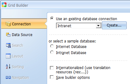
Click Next to proceed to step 2.
You now have to select a data source as well as the fields to be included in the grid.
| Parameter | Description |
|---|---|
| Data Source | Select the table or view to use as the data source. |
| Build Query |
Opens the Visual Query Builder window where you can setup a SQL query that will act as the grid data source. |
| Available Fields | This list-box shows all the fields available in the table or view. |
| Fields for the Grid | These are the fields to be shown in the grid. They are selected from among the Available Fields. |
 |
Refreshes the connection if you make changes to the database while using the builder. |
 |
Select a form field then click this button to move it upwards in the order of appearance. |
 |
Select a form field then click this button to move it downwards in the order of appearance. |
 |
Click this button to add it some fields to the form. |
 |
Select a form field then click this button to remove it from the form. |
 |
Opens the dialog with advanced properties. To activate the button select a field in the Fields for the Grid section.
Note: The following field types have advanced properties: CheckBox List, ListBox, Radio Button, Link and Image Link. CheckBox List, ListBox or Radio Button - Clicking on the button will open the 'List DataSourse' dialog illustrated below. Link and Image Link - Clicking on the button will open the dialog with link properties. |
| Order by | Select a field by which the records will be ordered by when initially displayed. |
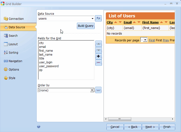
Once the fields have been added to the grid, you can to view the final grid. For the above setup, the illustration below shows how the grid will look with the current settings.
Note that if you are satisfied with the form at this point, you can click on the 'Finish' button to close the builder and generate the form.
To continue, click Next to proceed to step 3.
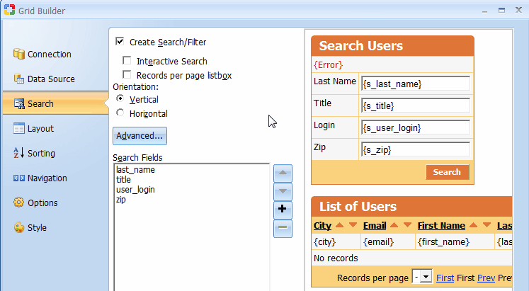
Add a search form that can be used to filter the records displayed in the grid form. This step is optional and if you don't want a corresponding search form for the grid, you can simply click the Next button to proceed to the next step.
| Parameter | Description |
|---|---|
| Create Search/Filter | Indicates your intention to create a search form. |
| Interactive search | Add autocomplete to the search form. |
| Sorting list box | Gives the search form two list-boxes for sorting. The first one will contain a list of all the available fields so that the user can select the field to sort by. The second list-box will indicate the desired sort order (ASC, DESC). |
| Records per page list box | The search form will have a list-box that can be used to specify the number of records to be returned per page. |
| Orientation | Specifies vertical or horizontal orientation of the search form. |
| Advanced... | Click this button to specify the advanced search option such as a submit method, type and other provided options. If the ‘AND’ condition is selected, the search form will contain an input control (textbox or listbox) for all selected database fields. If the ‘OR’ condition is selected, the search form will include only one textbox control and a value entered into the textbox will be used to search against all selected database fields. Alternatively, you can choose the “Advanced Search” option which creates a single textbox, while also automatically adding a listbox with search options, so that users can specify whether they want to search for “Any Words”, “All Words”, or “Exact Phrase”. |
| Available Fields | This list-box shows all the fields available in the table or view. |
| Search Fields | These are the fields to be shown in the search form. They are selected from among the Available Fields. |
|
Refreshes the connection if you make changes to the database while using the builder. |
|
Select a form field then click this button to move it upwards in the order of appearance. |
|
Select a form field then click this button to move it downwards in the order of appearance. |
|
Click this button to add it some fields to the form. |
|
Select a form field then click this button to remove it from the form. |
|
Opens the dialog with advanced properties. To activate the button select a field in the Fields for the Grid section.
Note: The following field types have advanced properties: CheckBox List, ListBox, Radio Button, Link and Image Link. CheckBox List, ListBox or Radio Button - Clicking on the button will open the 'List DataSourse' dialog illustrated below. Link and Image Link - Clicking on the button will open the dialog with link properties. |
| Control Type | Specify the control type to be used for each of the fields in the form. |
During the process of creating the search form, you can try out various options and preview them before deciding on the appropriate ones.
Click Next to proceed to step 4.
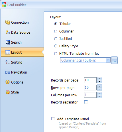
Select the desired design of the grid template and placement of components inside it. Here you have four layouts to choose from:
| Parameter | Description |
|---|---|
| Tabular | Grid layout that represents data in datasheet view, i.e in a form of rectangular table with column captions across the top, row identifiers (usually listed down the left margin), and the data in the cell where the row and column intersect. |
| Columnar | Grid layout, with column captions placed to the left of the data row. Each data source field corresponds to one row. |
| Justified | A layout where each data source field corresponds to two grid rows: field name is placed in one row and the data is shown in the row below it. |
| Gallery Style | Horizontal grid layout that is generally used for displaying an image
gallery. NOTE: When selecting the Gallery Style layout you may need to convert at least one of your controls to an image. You can do this after completing all Builder steps by right-clicking on the control in the Design mode and selecting Change To -> Image. |
You can also configure the following options if desired:
| Parameter | Description |
|---|---|
| Records per page | The number of records to be displayed per page by default. |
| Record separator | If checked, a template block called Separator will be inserted between rows (and alternating rows). |
| Rows per page (available when Gallery Style is selected) |
Number of gallery rows. |
| Columns per row (available when Gallery Style is selected) |
Number of gallery columns. |
| Add Template Panel | Insert Grid inside Template Panel. This option available only on pages with Designs. Read more... |
Click Next to proceed to step 5.
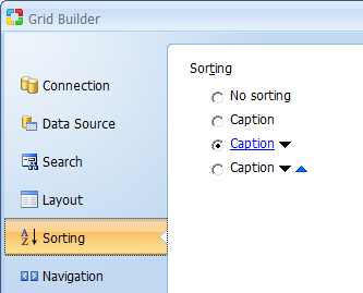
Further customize the grid form by selecting the caption to be used for sorting as well as the navigational controls.
| Parameter | Description |
|---|---|
| Sorting | Select the type of sorting controls that you want to have in the grid. |
Click Next to proceed to step 6.
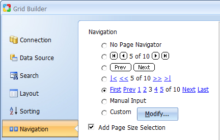
Further customize the grid form by selecting the caption to be used for sorting as well as the navigational controls.
| Parameter | Description |
|---|---|
| Page Navigator | Select the type of Navigation controls that you want to have in the grid. |
| Modify | The 'Custom Navigator' window allows you to add custom navigation controls to the form. |
Click Next to proceed to step 7.
Further customize the grid form by selecting the caption to be used for sorting as well as the navigational controls.
| Parameter | Description |
|---|---|
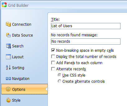
| Title | Title for the Grid |
| No records found message | Specify the message that will be displayed in the grid form if there are no records to be shown. |
| Non-breaking space in empty cells | Inserts a non-breaking space ( ) into empty grid cells. This option is used to make browsers display cell borders even if a cell is completely empty. |
| Display the total number of records | Specify if the label which shows the total number of records in the record set should be displayed above the grid. |
| Add Panels to each column (for Hide/Show functionality) | Specify if all controls are taken into the blocks of the following type: <!-- BEGIN ControlType ControlName --><!-- END ControlType ControlName --> It will be used to dynamically hide/show controls on the page. |
Alternate records
If this option is checked, every other record in the grid will appear in a row
with a different style than the preceding record. You can further choose how the
alternate rows should be implemented. Selecting “Create alternate controls”
will create two data rows, where one row will have a different background color
to emphasize the separation between consecutive rows. Selecting “Use CSS
style” applies the Set Row Style action to the Before Show Row
event of the grid, where in turn the main and alternate CSS style classes are
specified. By default the Set Row Style action will apply the Row style
class to standard grid rows and the AltRow class to alternate grid rows.
Both these classes are defined within the "Style.css" file used by the
current page or grid and can be modified as needed.
Click Next to proceed to step 8.
The final step is optional and involves selecting a style for the form.
| Parameter | Description |
|---|---|
| Style | This element contains a list of styles to choose from. |
The search form appears at the top with the grid right below it. Once done, click Finish to close the builder and generate the form.