 CodeCharge Studio
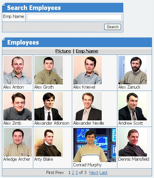
Gallery Builder is designed for creating a Web based image gallery as part of your application. The resulting gallery displays images in horizontal grid-like format and in fact it is fully based on the standard CCS grid component. The Gallery Builder creates a gallery by placing the grid component on the page and altering its HTML template to produce horizontal layout. Additionally, the the "Gallery Layout" action is applied to the grid's Before Show Row event, which opens and closes grid's table row tag (<tr>) based on the desired number of columns to be used in the gallery.
The Gallery Builder is available under the Builders tab of the Toolbox.
When launching it you will be provided with the following 6 simple steps to
generate a gallery.
Select or create a database connection from where the data shown in the gallery will be retrieved. Here you can select one of the existing database connections, create a new connection or select one of the sample databases.
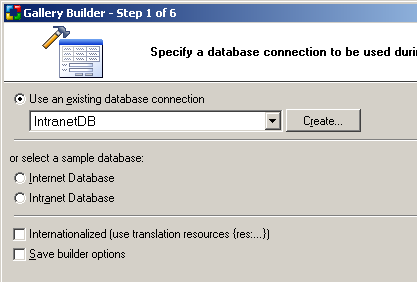
Click Next to proceed to step 2.
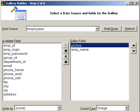
In this step you need to specify a data source and the fields to be included in the gallery.
| Parameter | Description |
|---|---|
| Data Source | Select a table or view to base your gallery on. |
| Build Query | Opens Visual Query Builder where you can design the database query or provide your own SQL statement or Stored Procedure to be used as gallery Data Source. |
| Refresh | Refreshes the list of tables and fields if you make changes to the database after having begun using the builder. |
| Available Fields | The list of fields available in the specified table or query. |
| Gallery Fields | These are the fields to be shown in the gallery. They are selected from among the Available Fields. |
 |
Select an Available Field then click this button to add it to the gallery. |
 |
Click this button to add ALL Available Fields to the gallery. |
 |
Select a gallery field then click this button to remove it from the gallery. |
 |
Click this button to remove all fields from the gallery. |
 |
Select a gallery field then click this button to move it upwards in the order of appearance. |
 |
Select a gallery field then click this button to move it downwards in the order of appearance./td> |
| Control Type | Specify the control type to be used for each of the fields in the form. Here you should specify Image or Image Link type for the picture field. |
Any number of fields can be specified where at least one of them should contain the URLs of images to be displayed, while others can contain image caption and any other information to be displayed above or below images.
After fields have been selected, click Next to go on to step 3, or
click the Preview button to view a basic gallery template.
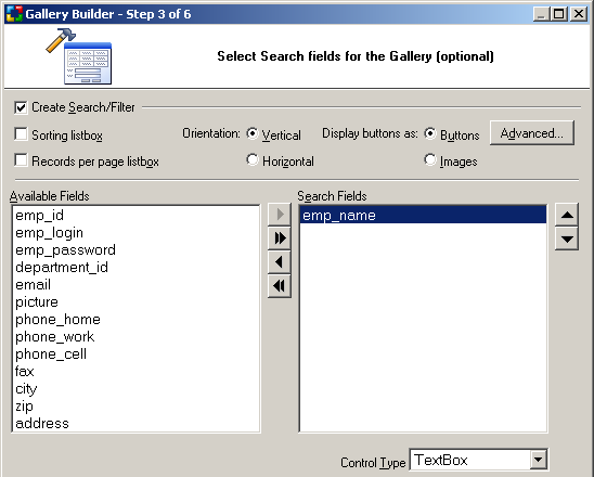
Step 3 is optional and should be used only if you want to provide a search form that will allow users to filter records displayed in the gallery.
| Parameter | Description |
|---|---|
| Create Search/Filter | Activate this option if you decide to create a search form for your gallery. |
| Sorting list box | Adds to the search form two listboxes for sorting. The first listbox will contain a list of all the available fields so that the user can select the field to sort by. The second listbox will indicate the desired sort order (ASC, DESC). |
| Records per page list box | If this option is selected the search form will have a listbox that can be used to specify the number of records to be returned on each page. |
| Orientation | Specifies vertical or horizontal orientation of the search form. |
| Advanced... | Click this button to specify additional features for the search form such as submit method (POST or GET), search type (meaning AND/OR conditions), Clear option to clear the search fields when clicked, etc. |
| Available Fields | This listbox shows all the fields available in the table or view. |
| Search Fields | This listbox displays the fields that will be shown in the search form. They are selected from among the Available Fields. |
|
Select an Available Field then click this button to add it to the form. |
|
Click this button to add ALL Available Fields to the form. |
|
Select a form field then click this button to remove it from the form. |
|
Click this button to remove all fields from the form. |
|
Select a form field then click this button to move it upwards in the order of appearance. |
|
Select a form field then click this button to move it downwards in the order of appearance. |
| Control Type | Specify the control type to be used for each of the fields in the form. |
Click Next to proceed to step 4.
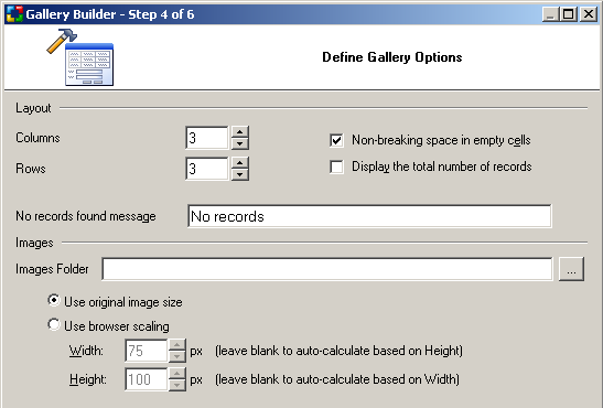
Step 4 allows you to define the following gallery layout options:
| Parameter | Type | Description |
|---|---|---|
| Layout | ||
| Columns | Number of columns to be used in the gallery. | |
| Rows | Number of rows to be displayed per page. Note: the total number of records per page will be equal to the number of Columns multiplied by the number of Rows. |
|
| Non-breaking space in empty cells | Inserts a non-breaking space ( ) into empty gallery cells. This option is used to improve the gallery layout since some web browsers do not display cell borders when a cell is empty. | |
| Display the total number of records | Add a label that displays the total number of records (images) retrieved by the gallery (data source). | |
| No records found message | Message text to be displayed if there are no records (images) returned by the data source. | |
| Images | ||
| Images folder | Either absolute or relative path to the image folder on the server. If relative path is specified, it should be relative to the folder of the current page. You can leave this option blank if images are stored in the same folder as the current page, or if your database contains absolute image URLs. | |
| Use original image size | Select this option if you want to display images in their original size. | |
| Use browser scaling | Select this option if you want to resize your images to match specific width or height. The images will be resized by the Web browser, which may result in poor image quality. | |
| Width | Specifies pixel width of the image to be resized. Leave blank if you want the width to be calculated based on the height specified below while preserving aspect ratio of the original image. | |
| Height | Specifies pixel height of the image to be resized. Leave blank if you want the height to be calculated based on the width specified above while preserving aspect ratio of the original image. |
Click Next to go on to step 5.
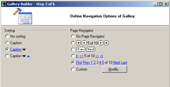
Further customize the gallery by selecting the caption type to be used for sorting as well as the navigational controls.
| Parameter | Description |
|---|---|
| Sorting | Select the type of sorting controls that you want to use in the gallery. |
| Page Navigator | Select the type of Navigation controls that you want to use in the gallery. |
| Modify | Opens 'Custom Navigator' window where you can configure custom navigation controls. |
Once you have made all the selections, you can use the preview button to to view how the final form template looks with the selected options.
Click Next to proceed to step 6.
The final step is optional and involves selecting a style to be applied to the Gallery. The Preview option provides immediate feedback on the form style you have chosen. You can also select "(No Style)" if you don't want to use any style or “(Dynamic)” if you want to assign a style dynamically at runtime.
Click the Finish button to close the builder and generate the form.
Press F9 to publish your project and enjoy!