 CodeCharge Studio
Use the Grid builder to create grid forms that can optionally have a related search form. The builder provides many options that would otherwise require a considerable amount of time to add manually. To begin the process, click on the Grid Builder option in the Builders tab of the Toolbox.
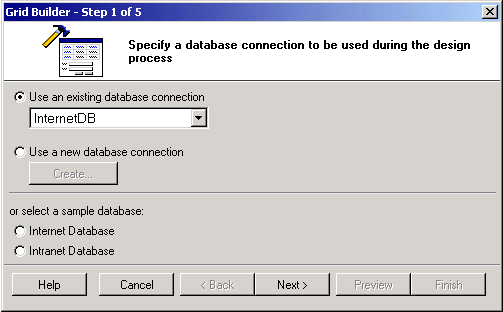
The first step involves selecting or creating a database connection from where the data shown in the grid will be retrieved. You can select one of the existing database connections, create a new connection or select one of the sample databases. Once done click Next to proceed.
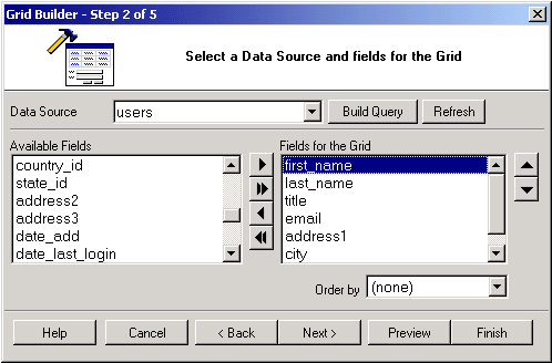
Having selected a connection, you now have to select a data source as well as the fields to be included in the grid.
| Parameter | Description |
|---|---|
| Data Source | Select the table or view from where the data will come from. |
| Refresh | Click this button to refresh the connection if you make changes to the database after having begun using the builder. |
| Build Query | Clicking this button will bring up the Visual Query Builder window where you can setup a SQL query that will act as the grid data source. |
| Available Fields | This listbox shows all the fields available in the table or view. |
| Fields for the Grid | These are the fields to be shown in the grid. They are selected from among the Available Fields. |
 |
Select an Available Field then click this button to add it to the grid. |
 |
Click this button to add ALL Available Fields to the grid. |
 |
Select a grid field then click this button to remove it from the grid. |
 |
Click this button to remove all fields from the grid. |
 |
Select a grid field then click this button to move it upwards in the order of appearance. |
 |
Select a grid field then click this button to move it downwards in the order of appearance./td> |
| Order by | Select a field by which the records will be ordered by when initially displayed. |
After having added fields to the grid and optionally set the Order by field, you can click on the 'Preview' button to see how the grid looks like at this point. For the above setup, the illustration below shows how the grid looks like in its current state of construction.
After previewing the grid, close the preview window and click on the 'Next' button to proceed. Note that if you are satisfied with the form at this point, you can click on the 'Finish' button to close the builder and generate the form.
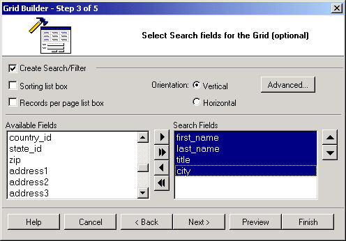
The next step involves adding a search form that can be used to filter the records displayed in the grid form. This step is optional and if you don't want a corresponding search form for the grid, you can simply click the 'Next' button to proceed to the next step.
| Parameter | Description |
|---|---|
| Create Search/Filter | Activate this option to indicate your intention to create a search form. |
| Sorting list box | If selected, the search form will have two listboxes for sorting. The first one will contain a list of all the available fields so that the user can select the field to sort by. The user will also be able to indicate the desired sort order (ASC, DESC) using the second listbox. |
| Records per page list box | If selected, the search form will have a listbox that can be used to specify the number of records to be returned per page after the search is conducted. |
| Orientation | Specify whether the search form should be vertically or horizontally oriented. |
| Advanced... | Click on this button to specify the advanced search option such as submit method, type and other properties. If AND is selected, the search form will have an input form control for all the fields. Otherwise, if OR is selected, the search form will have only one input form control. Any value entered into the single control will be used to search against all the fields in the form. After you set the advanced options you can use the 'Preview' button to see how the form looks like with either option selected. |
| Available Fields | This listbox shows all the fields available in the table or view. |
| Search Fields | These are the fields to be shown in the search form. They are selected from among the Available Fields. |
|
Select an Available Field then click this button to add it to the form. |
|
Click this button to add ALL Available Fields to the form. |
|
Select a form field then click this button to remove it from the form. |
|
Click this button to remove all fields from the form. |
|
Select a form field then click this button to move it upwards in the order of appearance. |
|
Select a form field then click this button to move it downwards in the order of appearance. |
| Control Type | Specify the control type to be used for each of the fields in the form. |
During the process of creating the search form, you should use the Preview button to see how the form looks with the selected options. You can therefore try out various options and preview them before deciding on the appropriate one.
After configuring the form satisfactorily, click on the 'Next' button to proceed.
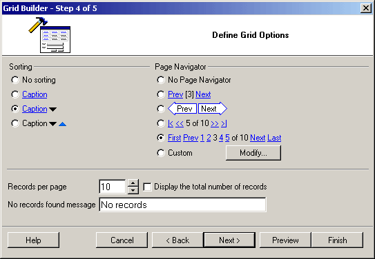
At this juncture, you can further customize the grid form by selecting the caption to be used for sorting as well as the navigational controls.
| Parameter | Description |
|---|---|
| Sorting | Select the type of sorting controls that you want to have in the grid. |
| Page Navigator | Select the type of Navigation controls that you want to have in the grid. |
| Modify | If you want to have custom navigation controls on the form, click on this button to open the 'Custom Navigator' window where you can customize the controls to suit your needs. |
| Records per page | Specify the default number of records to be shown per page. |
| No records found message | Specify the message that will be displayed in the grid form if there are no records to be shown. |
| Display the total number of records | Specify if the label which shows the total number of records in the recordset should be displayed above the grid. |
| Extended HTML (for Hide/Show functionality) | Specify if all controls are taken into the blocks of the following type: <!-- BEGIN ControlType ControlName --><!-- END ControlType ControlName --> It will be used to dynamically hide/show controls on the page. |
Once you have made all the selections, you can use the preview button to see how the form looks like and if necessary, make adjustments.
The final step is optional and involves selecting a theme for the form.

| Parameter | Description |
|---|---|
| Theme | This listbox contains a list of themes from which you can select one. |
| Style Type |
|
| Grid Layout | Specify the layout of the grid form as Tabular, Columnar, or Justified. |
| Alternate records | If this option is selected, every other record in the grid will appear in a row with a different background color than the preceding record. |
| Record Separator | With this option selected, each row where a record appears is followed by an empty row that separates it from the next row with a record. |
Clicking the 'Preview' button now will show the forms as they will look when generated. The search form appears at the top with the grid right below it. Once done, click on the 'Finish' button to close the builder and generate the form.