 CodeCharge Studio
The simplest and most convenient way of building an Editable Grid is to use the Editable Grid builder located under the Builders tab of the Toolbox. Open or create a new page where the Editable Grid will be located then with the cursor placed at the location where the form should appear, click on the Editable Grid option under the Builders tab of the Toolbox.

The first step involves selecting or creating a database connection from where the data to be edited or added using the record form is stored. You can select one of the existing database connections, create a new connection or select one of the sample databases. Once done click Next to proceed.

If you already have a connection configured for the project, you can elect to use one of the tables in this connection to create the Editable Grid. Alternatively, you can create a new connection or use one of the sample databases.
The Autoincremented primary keys checkbox should be activated if the records that will be contained in the Editable Grid will have autoincrement primary keys that are provided automatically by the database. With this option selected, the Editable Grid will not have an editable or submittable control for the primary key since that would results in a database error. Conversely, if primary keys are user provided, then this option should not be selected. In this case, the Editable Grid would have a field where the user can enter a value for the primary key.
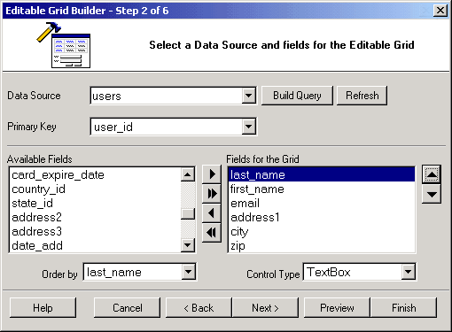
Having selected a connection, you now have to select a data source as well as the fields to be included in the editable grid form.
| Parameter | Description |
|---|---|
| Data Source | Select the table or query that contains the fields to be used in the EditableGrid. |
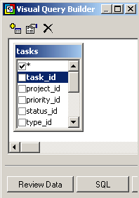
| Build Query | Click on this button to open the Visual Query Builder where you can construct a join query which retrieves fields from multiple tables. Within the Visual Query Builder window, you can select multiple related tables then select fields from those tables.
|
| Refresh | Click this button to refresh the connection if you make changes to the database after having begun using the builder. |
| Primary Key | If your design time connection is made using an OLEDB provider, CodeCharge Studio will automatically set the primary key for the selected table if one is defined in the database. However, other drivers such as ODBC drivers as well as connections to databases such as MySQL do not support the automatic discovery of the primary key field in which case you have to specify it manually. If the table contains a compound primary key that is made up or more than one field, then you have to use the Build Query button described above to specify all the primary keys.
Within the Visual Query Builder dialog, right-click on each of the fields that make up the primary key field and select the Primary Key option. The selected fields should then appear in bold. |
| Available Fields | This listbox shows all the fields available in the table or query. |
| Fields for the Record | These are the fields to be shown in the record form. They are selected from among the Available Fields. |
 |
Select an Available Field then click this button to add it to the form. |
 |
Click this button to add ALL Available Fields to the form. |
 |
Select a form field then click this button to remove it from the form. |
 |
Click this button to remove all fields from the form. |
 |
Select a form field then click this button to move it upwards in the order of appearance. |
 |
Select a form field then click this button to move it downwards in the order of appearance. |
| Order by | Select a field by which the records will be ordered by when initially displayed. |
| Control Type | Specify the control type to be used for each of the fields in the form. |
After having added fields to the editable grid and optionally set the Order by field, you can click on the Preview button to see how the editable grid looks like at this point. After previewing the editable grid, close the preview window and click on the Next button to proceed. Note that if you are satisfied with the form at this point, you can click on the Finish button to close the builder and generate the form.
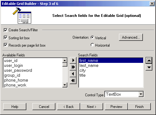
The next step involves adding a search form that can be used to filter the records displayed in the editable grid form. This step is optional and if you don't want a corresponding search form for the editable grid, you can simply click the Next button to proceed to the next step.
| Parameter | Description |
|---|---|
| Create Search/Filter | Activate this option to indicate your intention to create a search form. |
| Sorting list box | If selected, the search form will have two listboxes for sorting. The first one will contain a list of all the available fields so that the user can select the field to sort by. The user will also be able to indicate the desired sort order (ASC, DESC) using the second listbox. |
| Records per page list box | If selected, the search form will have a listbox that can be used to specify the number of records to be returned per page after the search is conducted. |
| Orientation | Specify whether the search form should be vertically or horizontally oriented. |
| Advanced... | Click on this button to specify additional features for the search form. You can specify whether the form should be submitted using the POST or GET method. You can also specify whether you want each database field to be represented by a search form field or alternatively have one search form field which can be used to search all database fields using the OR operator. |
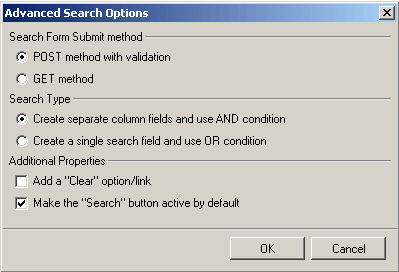
You can also opt to have a Clear option which would clear the search fields when clicked. Additionally, you can specify that the search button be the default button so that hitting the enter key would be the same as clicking the search button. |
|
| Available Fields | This listbox shows all the fields available in the table or view. |
| Search Fields | These are the fields to be shown in the search form. They are selected from among the Available Fields. |
|
Select an Available Field then click this button to add it to the form. |
|
Click this button to add ALL Available Fields to the form. |
|
Select a form field then click this button to remove it from the form. |
|
Click this button to remove all fields from the form. |
|
Select a form field then click this button to move it upwards in the order of appearance. |
|
Select a form field then click this button to move it downwards in the order of appearance. |
| Control Type | Specify the control type to be used for each of the fields in the form. |
Once again, during the process of creating the search form, you should use the Preview button to see how the form looks with the selected options. You can therefore try out various options and preview them before deciding on the appropriate one. After configuring the form satisfactorily, click on the Next button to proceed.
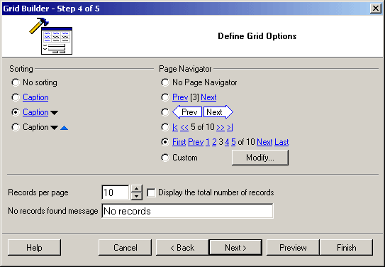
At this juncture, you can further customize the editable grid form by selecting the caption to be used for sorting as well as the navigational controls.
| Parameter | Description |
|---|---|
| Sorting | Select the type of sorting controls that you want to have in the grid. |
| Page Navigator | Select the type of Navigation controls that you want to have in the grid. |
| Modify | If you want to have custom navigation controls on the form, click on this button to open the Custom Navigator window where you can customize the controls to suit your needs.
|
| Records per page | Specify the default number of records to be shown per page |
| No records found message | Specify the message that will be displayed in the grid form if there are no records to be shown. |
| Display the total number of records | Select this option if you want the form to display the total number of records that are retrieved in a form. |
Once you have made all the selections, you can use the Preview button to see how the form looks like and if necessary, make adjustments.
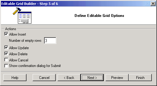
You now have to decide the kind of functionality that will be available in the editable grid form. You can uncheck any of the options if you don't want the form to have the corresponding functionality.
| Parameter | Description |
|---|---|
| Allow Insert | Specify whether the Editable Grid should allow the user to insert new records. You can also use the Number of empty rows property to specify the number of empty rows that should be provided for the purpose of inserting new records. |
| Allow Update | Specify whether the Editable Grid should allow the user to update existing records. |
| Allow Delete | Specify whether the Editable Grid should allow the user to delete existing records. |
| Allow Cancel | Specify whether the Editable Grid should have a cancel button which would abort any current operation and return to the page specified in the Return Page property of the form. |
| Show Confirmation dialog for submit | With this option selected, the user would always be prompted to confirm the insert, update or delete operations. |
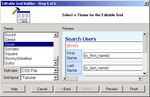
In the final step, you optionally select a theme for the editable grid form. The Preview portion of the window shows how the form would look like with the currently selected theme.
| Parameter | Description |
|---|---|
| Theme | This listbox contains a list of themes from which you can select one. |
| Style Type |
|
| Grid Layout | Specify the desired layout of the grid form (Tabular, Columnar or Justified). |
You can click the Preview button to see how the form would look with a particular theme. After selecting a theme, click on the Finish button to generate the form to the page.