 CodeCharge Studio
The Date Picker builder is used top create a pop-up date picker, which allows to select a value transferred into the control (usually Text Box) on the page set in the Date Picker's Control property.
To begin the process of creating a Date Picker component, click on the Date Picker Builder option in Builders tab of the Toolbox. Note that the Date Picker can be placed only on the Record or Editable Grid. If you try to place the component outside the mentioned forms the following message appears: Date Picker can be inserted only into Record, Editable Grid.
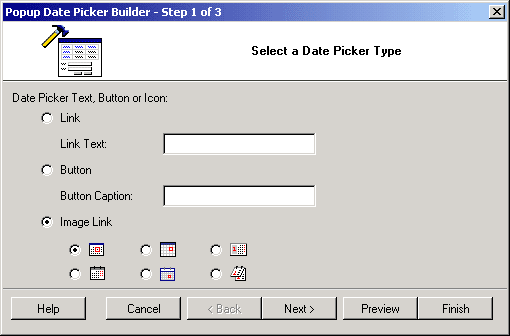
In the first step, you have to select the type of the Date Picker you want to add to the page.
| Parameters | Description |
|---|---|
| Link | Select this option to add the Date Picker as a link. Enter the text for the link into the TEXT LINK field. |
| Button | Select this option to add the Date Picker as a button. Enter the caption for the button into the BUTTON CAPTION field. |
| Image Link | Select this option to add the Date Picker as an image link. Also select one of the icon options below. |
You can click on the Preview button to see how the form looks like in its current state of construction.
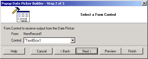
The next step allows you to specify the form control to receive output from the Date Picker.
You can click on the Preview button to see how the form looks like in its current state of construction.
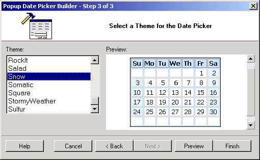
The final step involves the selection of a theme for the form.
You can use the Preview button to see how the form looks like. Click the Finish to close the builder and generate the form.